

How it renders
The email body is 600 pixels wide. A section fills that width edge to edge, and its blocks sit in a column inside the padding you set.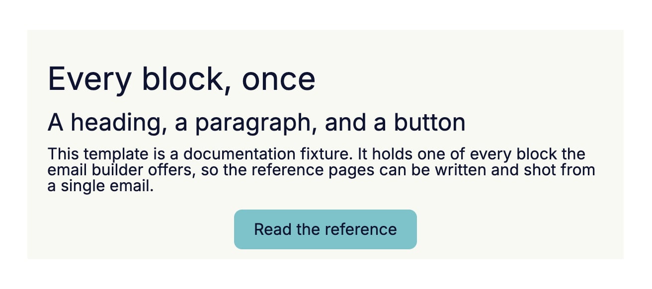
Settings
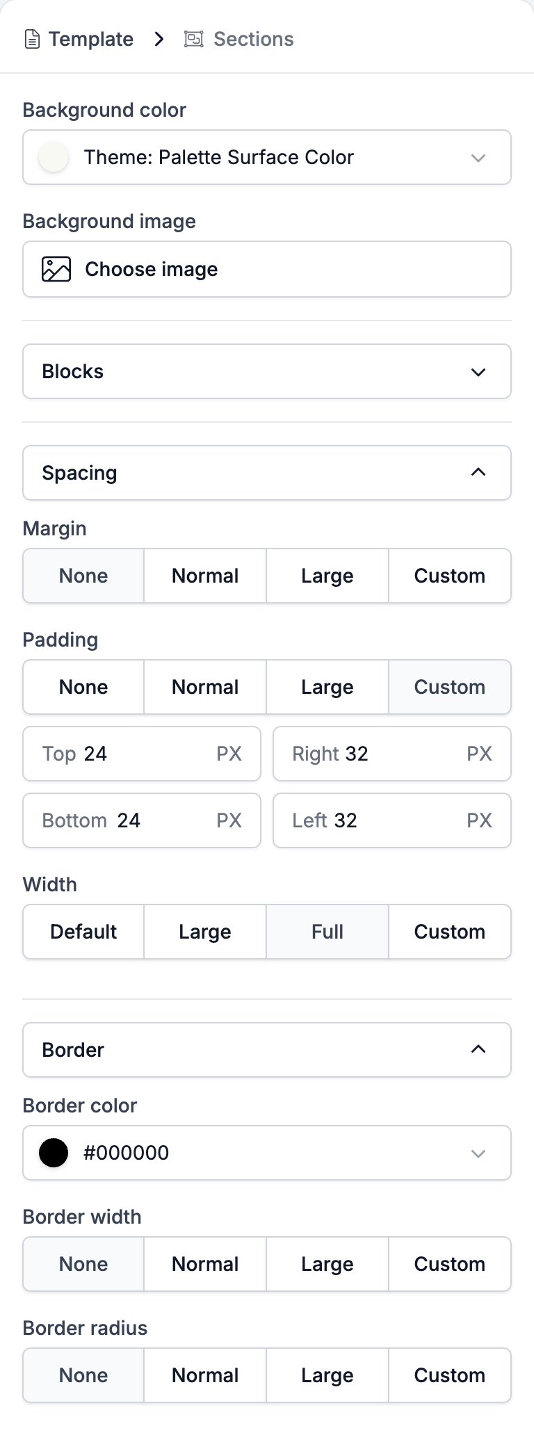
- Background color fills the band. It starts on the brand’s surface colour, which the control names rather than showing as a hex code.
- Background image takes a picture from the media library through Choose image, and it sits behind the whole band. The same picker offers the variables that carry an image, so the background can follow the brand.
- Blocks lists what the section holds, in order. + opens the menu of blocks you can add, − deletes a row, and the handle on the left drags it.
- Spacing holds three controls.
- Margin is the gap outside the band: None, Normal, Large, or Custom for a top and a bottom value in pixels.
- Padding is the gap inside it, with the same four choices and a box per side.
- Width sets how wide the blocks inside the section run: Default, Large, Full, or Custom, which opens a slider from 640 to 1240 pixels.
- Border holds three controls.
- Border color is a colour picker.
- Border width is None, Normal, Large, or Custom for a value per side.
- Border radius is the same four choices, for a value per corner.
Related
- Email Builder: Overview covers the builder, the toolbar, the theme, and every block type.
- Template is the only place a section can go.
- Two Columns splits one section into two.
- Variables covers the image tokens the Background image picker offers.