The builder at a glance
The builder has three parts. The left column lists the form’s fields in the order a respondent meets them. Above the list sit the Content, Logic, and Evaluation tabs, and the + button that opens the Add Content palette. The right column previews the form, with its own Interactive Preview, Conversational Preview, and Test & Evaluate tabs. The bar across the top holds the form name and the toolbar.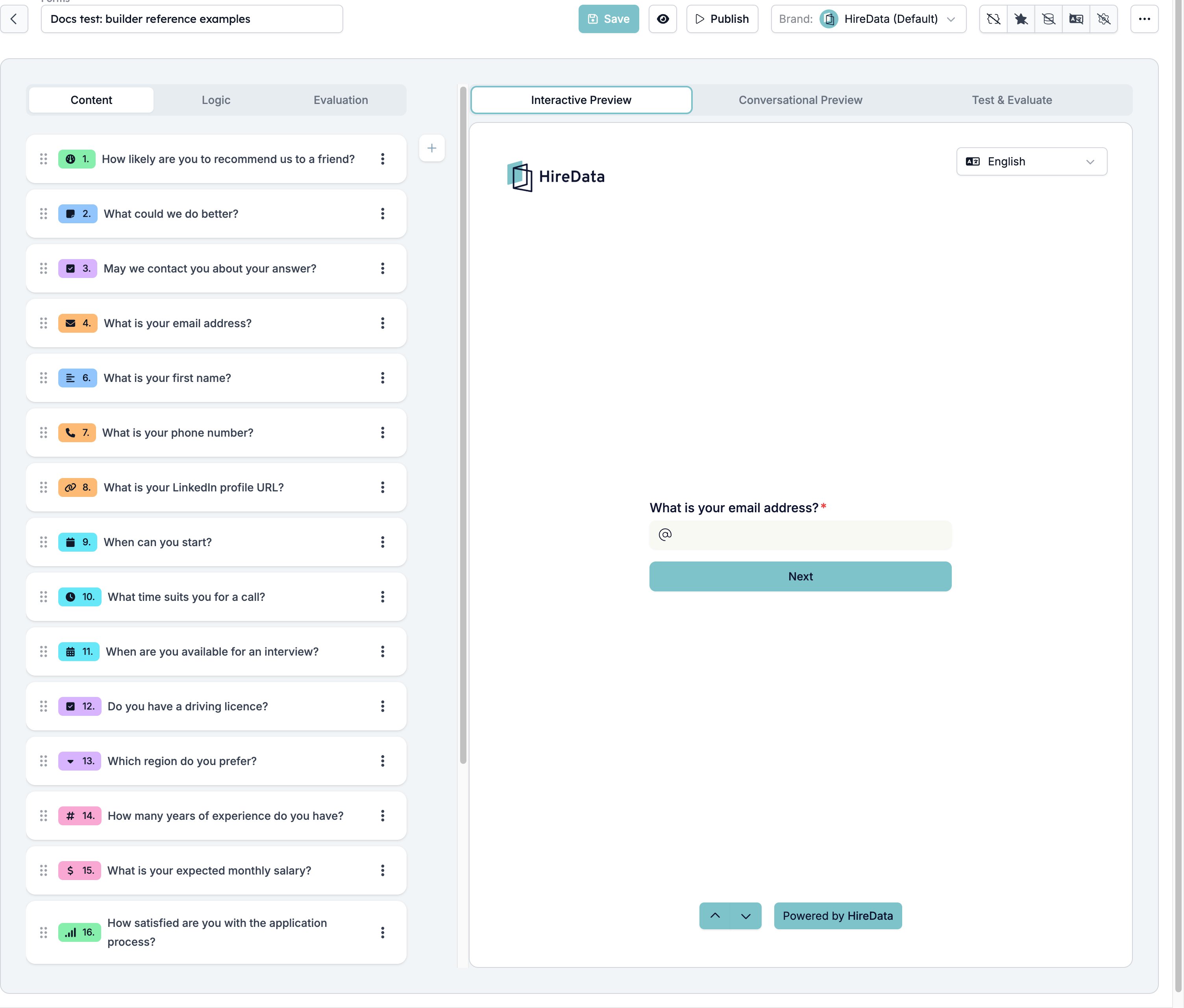
Content tab
The Content tab holds the fields and their settings. Click a field to open its card, and drag it by the handle on the left to change the order. The + button opens the Add Content palette. It groups the entries by category and repeats the most used ones under Recommended. Find a field type searches the list.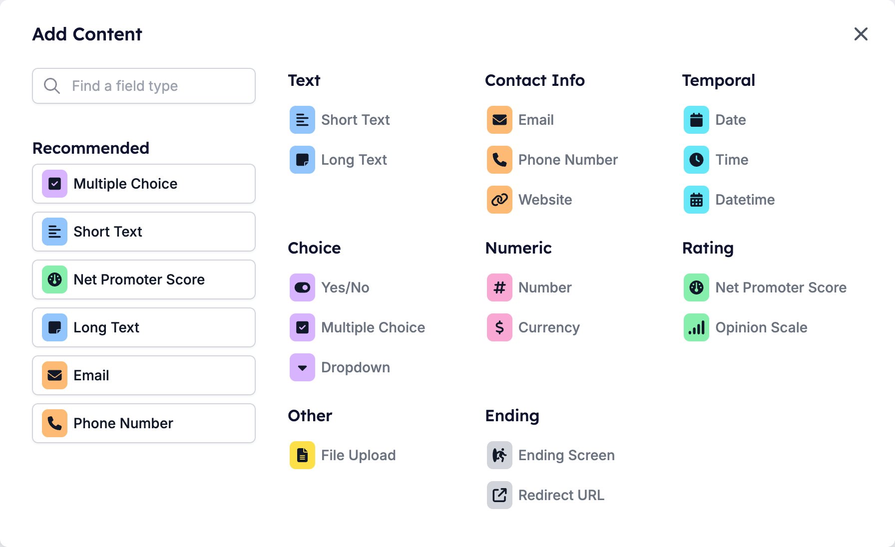
Logic tab
The Logic tab decides where a respondent goes next. Every question gets an Add Rule button and a footer target, and a rule readsif <field> <operator> <value> then go to <target>.
See Logic for the operators each field type offers, the branching patterns worth copying, and what to check when a rule does not fire.
Evaluation tab
The Evaluation tab turns a finished response into something a recruiter can act on. It holds five evaluators, each with a switch: Summary, Criteria, Scoring, Skills, and Generated fields. Switch one on here and, for the three that work question by question, it also gets a switch on every field card, so you can configure it without leaving the Content tab. See Evaluation for what each evaluator decides, what it hands back, and the order you have to switch them on in.Preview panel
Interactive Preview walks the web form, running the same logic the public form runs. Conversational Preview shows the chat version. Test & Evaluate fills in a whole response and runs the evaluators over it. See Previews and Test & Evaluate.The toolbar
The toolbar runs along the top right of the builder, from Save to the three-dot menu.
- Show variable list lists the variables the form can use, each with its type and current value, and a Search box to filter them. See Variables.
- Manage Template publishes the open form to the shared template library. It appears only for accounts that maintain that library, so most workspaces never see it. See Templates.
- Show objects links records such as a vacancy or a match to the form. See Objects.
- Manage Languages sets the form’s default language and its translations. See Languages and translations.
- Settings holds the theme and the public toggle. See Theme and publishing.
Choosing a field type
The palette shows more entries than there are field types. Short Text and Long Text, Multiple Choice and Dropdown, and Net Promoter Score and Opinion Scale are each one type with two settings, switched in the field card’s footer. Every row below has a page of its own, covering that type’s settings, what it stores, the operators logic offers for it, and what the AI evaluators can do with it.
The type also decides which operators a rule can use on that question. Logic has the full table.
Every field type except the two endings can feed the AI evaluators: Criteria, Scoring, and Skills. See Evaluation.
A few more field types exist than the palette offers: Range, Color, and the Star, Thumbs, Emoji, and Slider variants of a rating. Only an integration such as the HireData API can add them. If one turns up in a form you did not build, it works, but the builder has no settings card for it.
Settings every field shares
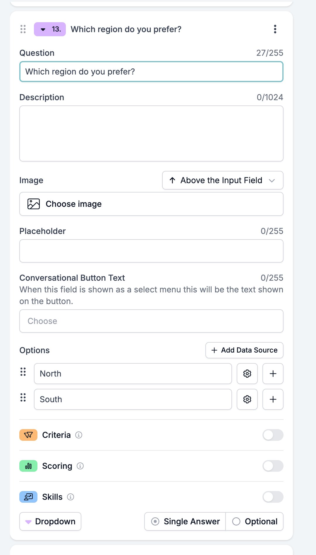
Click a field to open its card. The settings every field shares sit at the top and bottom, with the type’s own settings in between.- Question, up to 255 characters. Ending screens call this Title.
- Description, up to 1024 characters, shown under the question.
- Image, with a placement selector that defaults to Above the Input Field. The other placements are Left Side of Field, Right Side of Field, Right Half of the Page, Left Half of the Page, and Background.
- A Criteria, Scoring, and Skills switch, one for each evaluator you turned on for the form.
- A footer holding the button that opens Display & requirements, and the type switch for the types that come in two flavours: Short Text and Long Text, Yes/No’s Checkbox and Toggle, Multiple Choice and Dropdown, Net Promoter Score and Opinion Scale.
- Auto reply (on answer) is sent as soon as the respondent answers the question. Yes/No replaces it with a reply per answer, and Multiple Choice and Dropdown move it onto each option.
- Auto reply (on invalid answer) appears once Required is on. The builder describes it as the message sent when a required question is answered incorrectly.
Display and requirements
The button at the bottom right of a field card opens Display & requirements. Its label tells you the current state of the field: Optional, Required, Hidden, or Always included.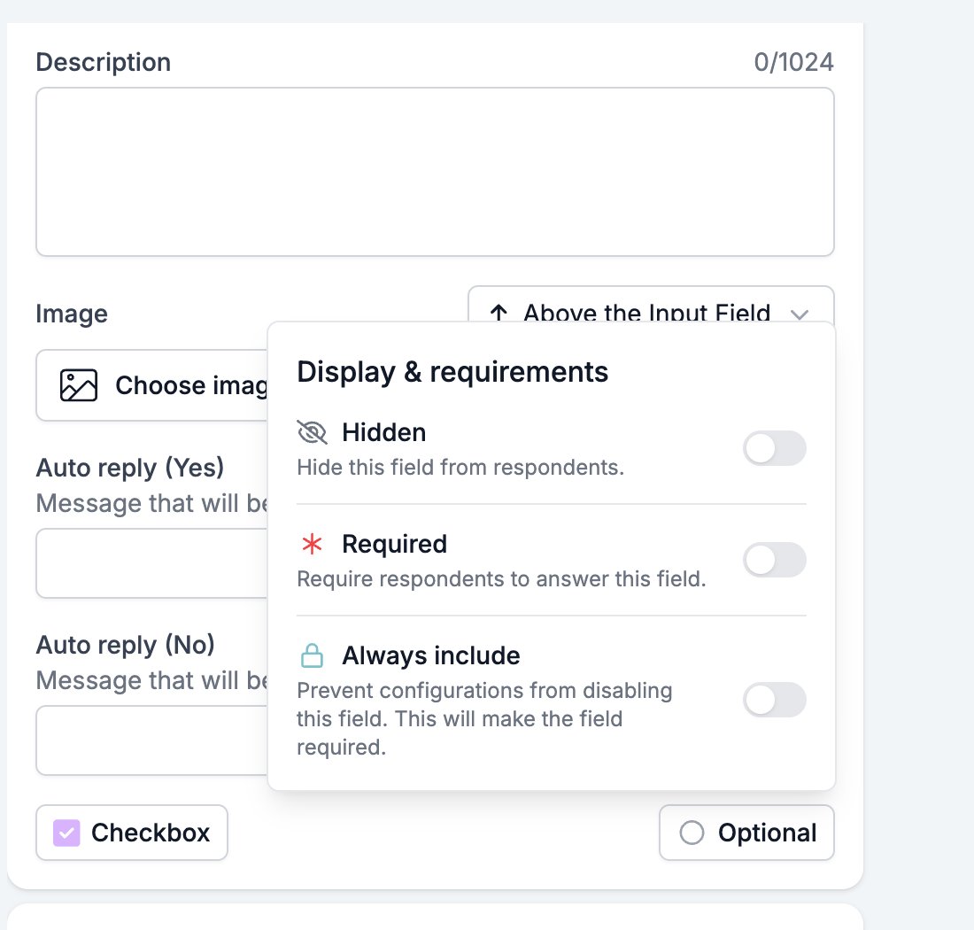
What counts as an answer
An empty text box, an empty number box, no option chosen, and no file attached all count as no answer. The web form then shows a message under the question, such as “This field is required and cannot be empty.” In a conversational form, Auto reply (on invalid answer) is the message sent back when a required field receives no usable answer.Objects and data sources
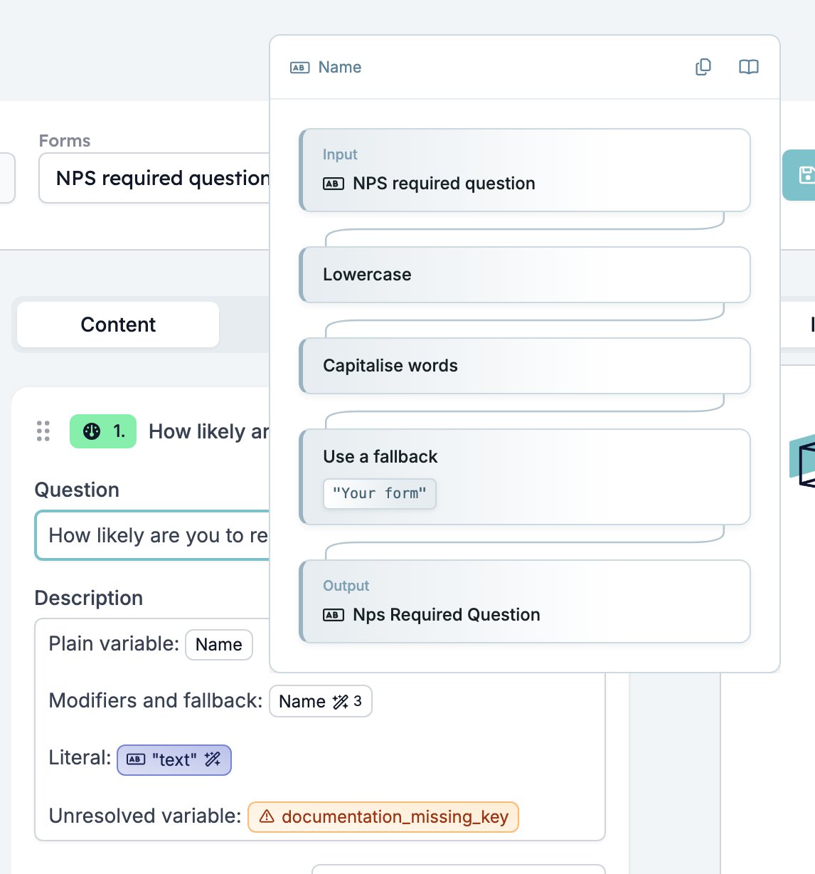
Show objects in the toolbar links records to the form. Link a vacancy and its fields become variables you can write into any question, and the object at the top of the list decides which records you can configure the form for. See Objects. Add Data Source on a Multiple Choice or Dropdown field fills its options from a list your workspace already keeps, instead of options you type. The list belongs to the workspace, so editing it changes every question that uses it. See Data sources.Theme and publishing
The Settings drawer controls how the form looks and who can reach it.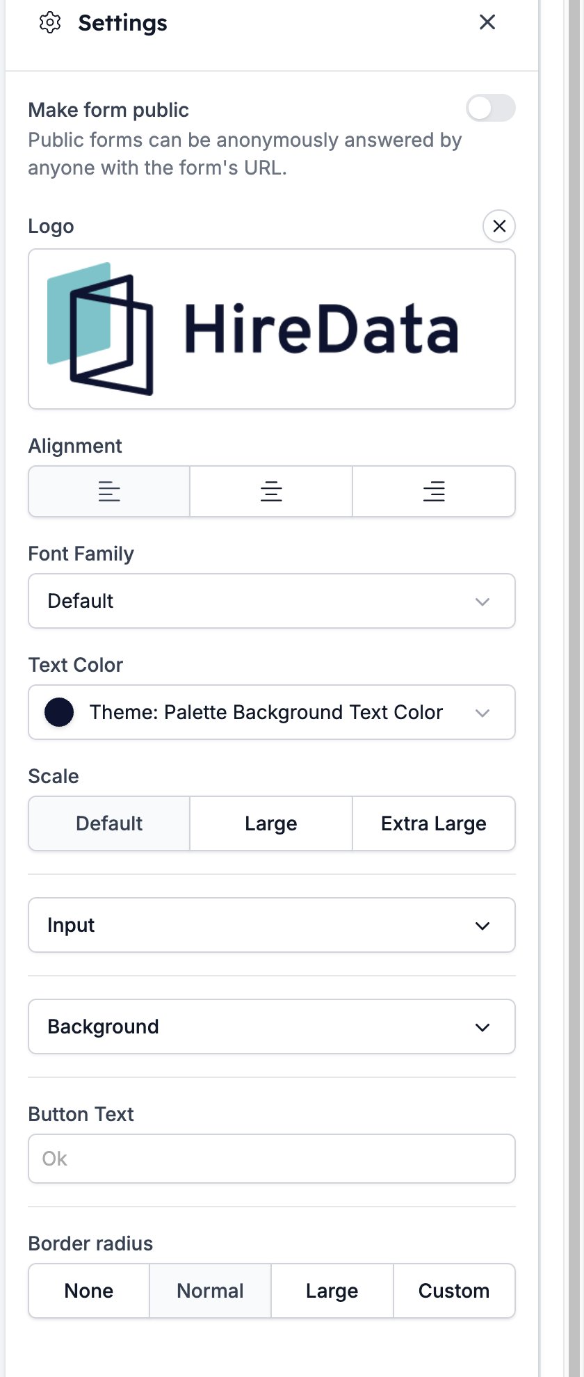
- Logo, the image at the top of the form. It starts as your brand logo, and the cross next to the label removes it.
- Alignment, which puts the question text and inputs on the left, in the centre, or on the right.
- Font Family, the typeface the form uses.
- Text Color, the colour of the form’s text.
- Scale, which sizes the text and inputs: Default, Large, or Extra Large.
- Input, a section holding the answer boxes’ Variant (Solid, Soft, or Outline), Color, Background Color, Button Color, and Button Text Color.
- Background, a section holding a Background Image and a background Color.
- Button Text, the label on the button that moves the respondent on. It reads “Ok” until you change it.
- Border radius, offering None, Normal, Large, and Custom.
Languages and translations
Manage Languages in the toolbar sets the form’s Default language and lists its translations. The default language is the one you wrote the questions in. Click New Translation to add one. Pick the Language, then either translate by hand or click Create AI translation, which fills the whole form for you.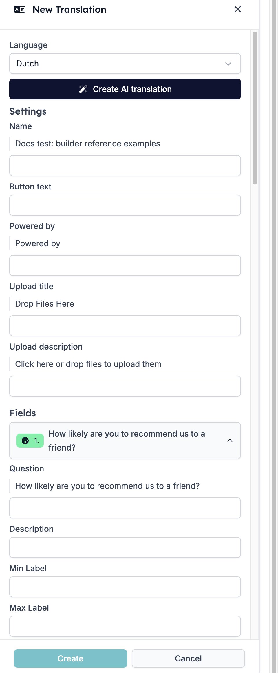
- Settings, the form Name, the Button text, the Powered by line, and the Upload title and Upload description of a file upload.
- Fields, every field in the form. Each one holds its Question and Description, plus whatever text its type adds, such as a rating’s Min Label and Max Label, a choice field’s Conversational button text, and its options with their auto replies.
- Validation, the messages a respondent sees when an answer does not pass, such as Field Is Required, Invalid Email, and Max Number.
Templates
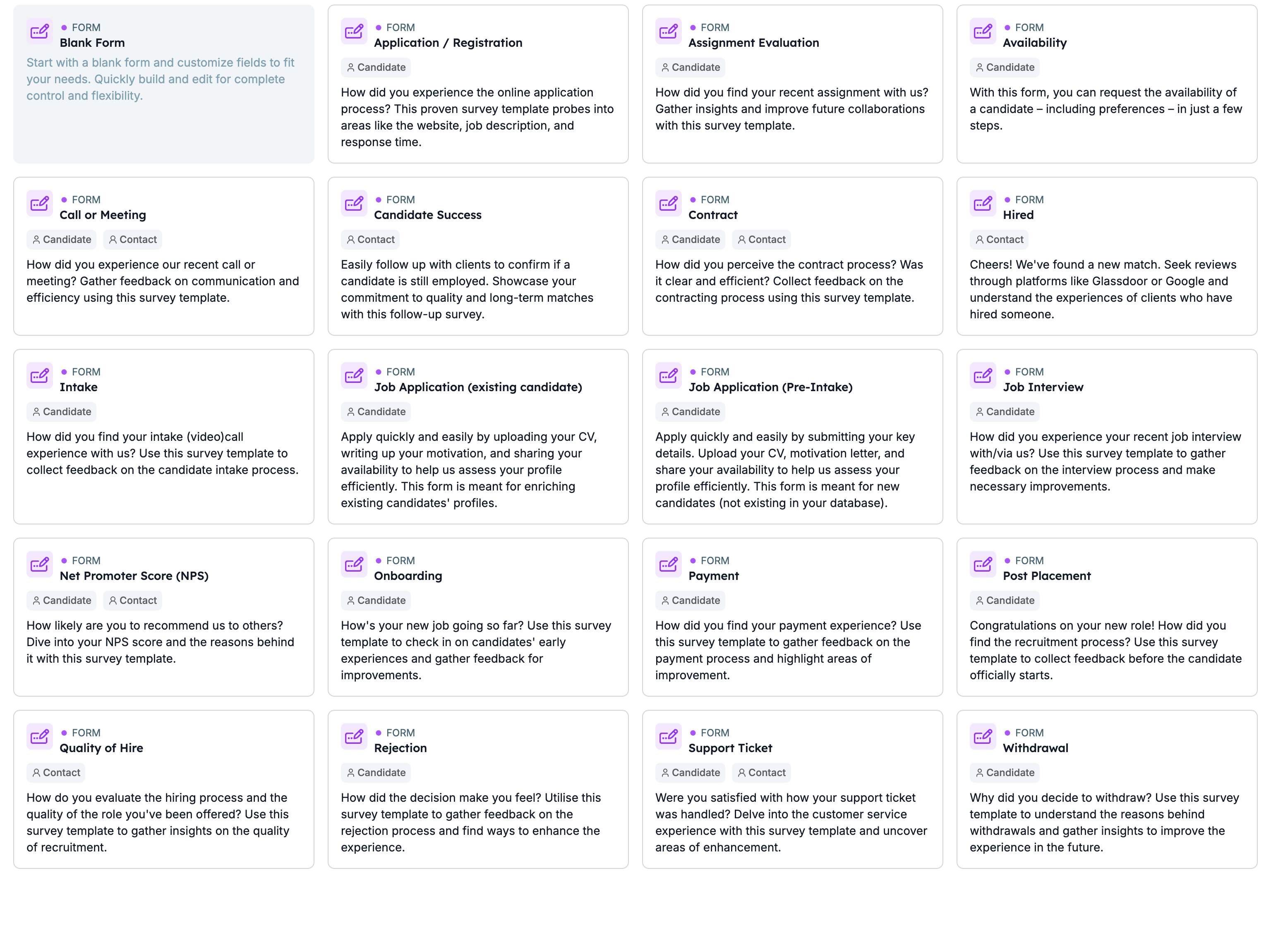
Click New Form and a gallery opens with Blank Form as the first card. The rest are ready-made recruitment forms such as Job Application (Pre-Intake), Intake, Rejection, and Net Promoter Score (NPS), each with a description of what it asks and a tag for the record it suits. The Candidate and Contact chips at the top filter the gallery. Picking a template copies its fields into a new form, and everything in the copy is yours to change.