

How it renders
What the block puts in the email depends on the type of the leading question.- Net Promoter Score renders eleven buttons, 0 to 10, whatever range the question itself carries.
- Opinion Scale renders one button per point on its own range, with the question’s end labels underneath in capitals.
- Multiple Choice and Dropdown render one button per option.
- Everything else renders a single call to action reading “Give Feedback”. Click it in the email to write your own wording.

Settings
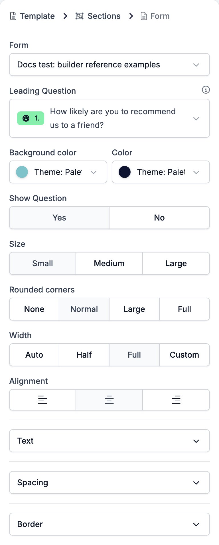
- Form picks the form to point at. The list searches every form in the workspace.
- Leading Question picks the question the buttons answer. Hidden questions and ending screens are left out of the list.
- Background color and Color style the buttons.
- Show Question puts the question’s own wording above the buttons, or leaves it out.
- Size is Small, Medium, or Large, which sets the text size and the padding together.
- Rounded corners is None, Normal, Large, or Full, from square to a full pill.
- Width is Auto, Half, Full, or Custom, which opens a slider from 35 to 100 per cent.
- Alignment is left, centre, or right.
- Text holds Font Family with a weight selector, Size, Letter Spacing, and Line Height.
- Spacing holds two controls.
- Margin, the gap above and below the buttons.
- Padding, the space between the label and each button’s edge.
- Border holds Border color, Border width, and Border radius.
Limits
- A choice question renders its first five options only. A sixth option gets no button, no warning, and no sign in the canvas that it is missing. Reorder the question so the five that matter come first, or point the block at a shorter question.
- A Net Promoter Score question is always 0 to 10 here. Whatever range the question carries is ignored.
Related
- Email Builder: Overview covers the builder, the toolbar, the theme, and every block type.
- Form Builder: Overview covers the forms a Form block can point at.
- Net Promoter Score and Opinion Scale is the question type behind the eleven buttons.
- Multiple Choice and Dropdown is the question type capped at five buttons.
- Section is the only block a Form can go in.
- Translations covers the rating labels and call to action a Form block offers per language.